
The Local Design | You're Just My Type: Palm Springs Fonts
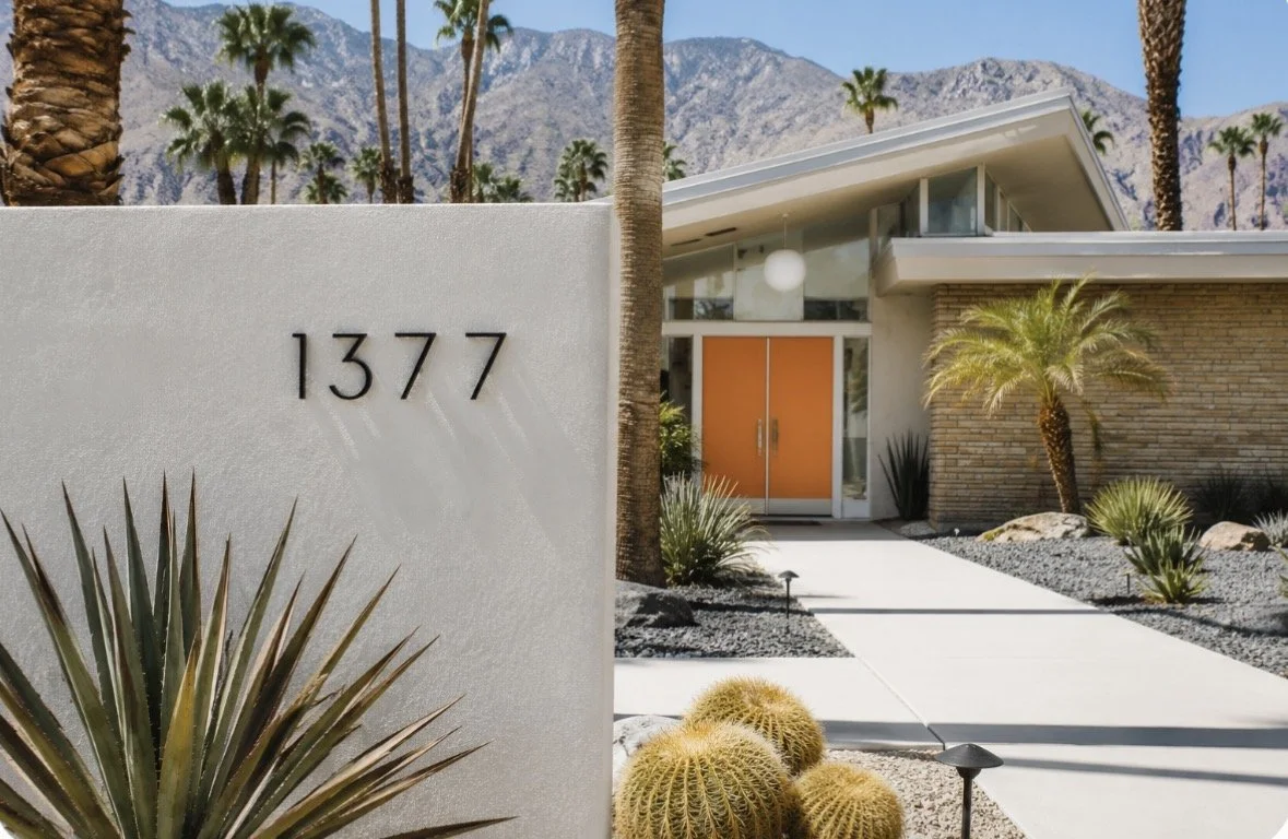
Palm Springs mid-century home with Neutraface house numbers
There are few places where a house number can make you smile.
Palm Springs is one of them.
Because in Palm Springs even the house numbers were designed.
That sounds like a minor thing until you start noticing it — the tall, geometric address numerals on a Krisel home, the crisp lettering on a vintage motel marquee, the careful typography on a mid-century storefront.
These weren't afterthoughts.
They were part of a complete design philosophy, one that arrived in the desert during a specific moment in American history and never quite left.
In Palm Springs, design permeates everything.
The Mid-Century Alphabet
During the mid-century era, everything was changing.
Buildings became cleaner.
Furniture became lighter.
Cars grew tailfins and then lost them—eventually.
Even the letters themselves became simpler.
Sans serif, serif?
(Whatever will be, will be—with apologies to Doris Day)
Sans serif it was. Gone were ornate Victorian flourishes and decorative scripts that looked as though they belonged on wedding invitations or bank certificates. Designers embraced geometric forms, clean lines and uncomplicated shapes. Typography became optimistic, modern and easy to read.
If the future was arriving, the letters might as well look like they had come with it.
Palm Springs became one of America's greatest showcases for this philosophy.
America Was Feeling Pretty Good About Itself
It's easy to forget just how optimistic the 1950s and early 1960s felt.
The United States had emerged from World War II as the world's dominant economic power. Families were buying homes. Interstate highways stretched across the country. Commercial aviation was becoming glamorous. Television was filling living rooms. The Space Race suggested tomorrow would always be bigger and brighter than today.
We liked Ike and swooned for Kennedy's Camelot.
Design reflected that confidence.
Everything seemed streamlined.
Everything looked efficient.
Everything promised a better future.
The typography of the era mirrored that outlook. Sans-serif lettering, geometric forms and generous spacing suggested clarity, confidence and progress.
The future, apparently, came in Futura.
Or one of its many stylish cousins.
Palm Springs Became the Perfect Laboratory
Palm Springs wasn't burdened by centuries of architectural tradition.
It was building itself during the exact moment modernism was exploding.
Architects, graphic designers, sign makers and developers all seemed to agree that clean was beautiful.
Drive through neighborhoods like Vista las Palmas, Twin Palms or Deepwell, and you'll notice something remarkable.
The fonts belong.
They feel like part of the architecture.
Because they were.
Meet the Neutraface Numbers
Perhaps no set of numbers has become more closely associated with Palm Springs than the elegant "Neutraface" addresses seen on countless mid-century homes.
Ironically, the famous font wasn't actually designed by architect Richard Neutra himself.
It was developed decades later by Canadian type designer Christian Schwartz, who collaborated with Neutra's son, Dion, to create a typeface inspired by Neutra's architectural lettering and graphic sensibilities.
Neutra's buildings often featured precise, carefully proportioned lettering that reflected the same disciplined modernism found in his architecture. Schwartz translated that aesthetic into a complete type family that designers could actually use.
The result feels unmistakably Palm Springs.
Tall. Graceful. Geometric.
Modern without trying too hard.
Today, Neutraface numbers have become almost mandatory for homeowners restoring mid-century houses. It's like putting whitewall tires on a classic Thunderbird.
Not surprisingly, Neutraface has also found its way into contemporary branding, appearing everywhere from Shake Shack and West Elm to book covers, movie posters and even the headlines of The New Yorker.
Why Did It All Come Back?
After the ornate excesses of the 1980s and the faux-Tuscan enthusiasm of the early 2000s, many people began craving something quieter.
Something simpler.
Mid-century modern suddenly felt fresh.
Eventually, almost every design movement gets another turn.
Its emphasis on craftsmanship, proportion and restrained elegance looked timeless rather than nostalgic.
And the public had become aware of typography.
You can thank Steve Jobs for that.
He famously audited a calligraphy course while in college, and later insisted that the Macintosh include beautifully designed fonts.
Millions of people suddenly noticed typography in ways they never had before.
Social media picked up on it.
Instagram rewarded clean lines.
Pinterest rewarded beautiful homes.
Television discovered that every renovation show looked better with butterfly roofs and globe lights.
Palm Springs was waiting patiently the entire time.
Everyone else simply caught up.
The Small Details Matter
Typography is one of those design choices people notice without consciously noticing.
It quietly tells you what kind of place you're in.
A weathered motel sign with crisp geometric lettering suggests adventure.
A restaurant menu set in thoughtful typography subtly promises that someone cared about the mood as well as the food.
A beautifully chosen address number says something about the people who live inside.
Even the words you're reading now have been thoughtfully considered.
The headings are Grand Hotel, a typeface that nods to Palm Springs glamour before the modern era.
The body text is Josefin Sans, whose clean architectural lines feel right at home in a city that loves mid-century design.
I think they play well together.
What do you think?
Good design whispers.
It rarely needs to shout.
Look Up Before You Look Down
The next time you're walking through Palm Springs, or maybe when you're on one of our food tours, spend some time looking at the details.
Look at the address numbers.
Someone chose those fonts.
Someone believed the future should look exactly like this.
Remarkably, decades later, those fonts still do.
And if you'd like someone to point out those hidden design details while introducing you to some of downtown's best restaurants, well, that's exactly what we love doing here at Devour the Desert, the official blog for Artisan Food Tours.
Our walking food tours combine local history, architecture, celebrities, neighborhood stories and some of Palm Springs' most memorable food. You'll leave with a full stomach, a deeper appreciation for the city—and quite possibly a new appreciation for house numbers.
Sometimes great design is hiding in plain sight.
You just have to look. And then look again.
Enjoyed this article? Explore more of our "Local …" series to discover the Palm Springs stories that helped shape the desert's singular character. You'll find collections devoted to food, architecture, celebrities, history, culture and the people who continue to make Palm Springs unlike anywhere else.
Dave Ball is a local tour guide and co-owner of Artisan Food Tours with his wife, Phyllis. He spends an inordinate amount of time thinking about Palm Springs history, neighborhood architecture, and the pursuit of a great meal. His reigning food obsession remains local Deglet Noor dates with Fix & Fogg Crunchy Peanut Butter, but the breakfast bread at Bread & Flours Bakery in Palm Springs is mounting a serious challenge for the title. Stay tuned for this rapidly developing story.